Tazza
Orange-coffee protein bar
Rundown
Packaging design
using photography and simple illustrations
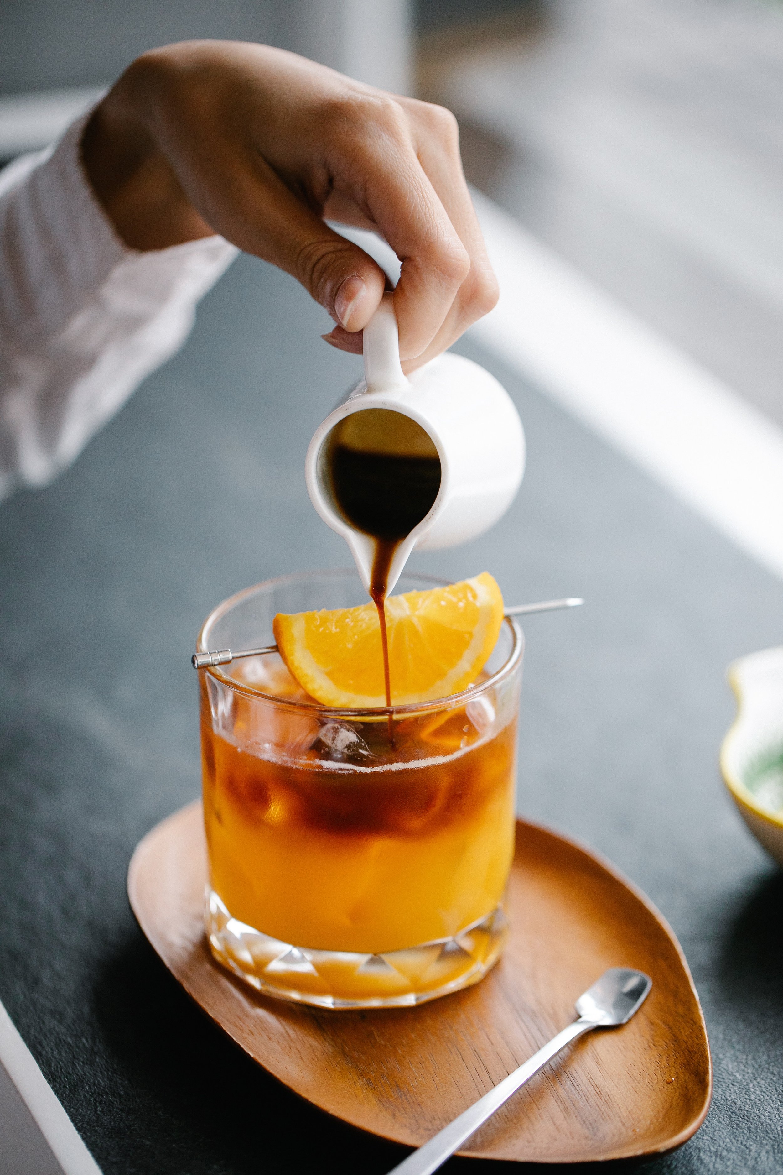
Tazza is an orange coffee-flavored protein bar. The movement in the illustrations expresses a flow to insinuate awakeness in the human body. Warm colors like oranges and yellows create an appetite in customers along with energy. Photographs of coffee beans, coffee cake, and oranges easily show customers what flavor this protein bar is. My choice of combining photography and simple illustrations creates a strong composition by providing important information in the front like quick nutrition information, flavor, tagline" “espresso yourself” etc…

design details
I came up with the name Tazza because the so-called “word” Taz to me sounded energetic and I feel as though an energy bar is congruent to the expression of Taz. The typeface for TAZZA is an all-caps called Canberra Regular that is inspired by Old Circus Alphabet fonts. I wanted the texture to come into play with this packaging to add more visual interest like the low-opacity polka dots as the background, and the movement from the curved-off sections that are either brown orange/yellow or the coffee beans.
