OAKAO
Oats and berries yogurt
Rundown
Packaging design
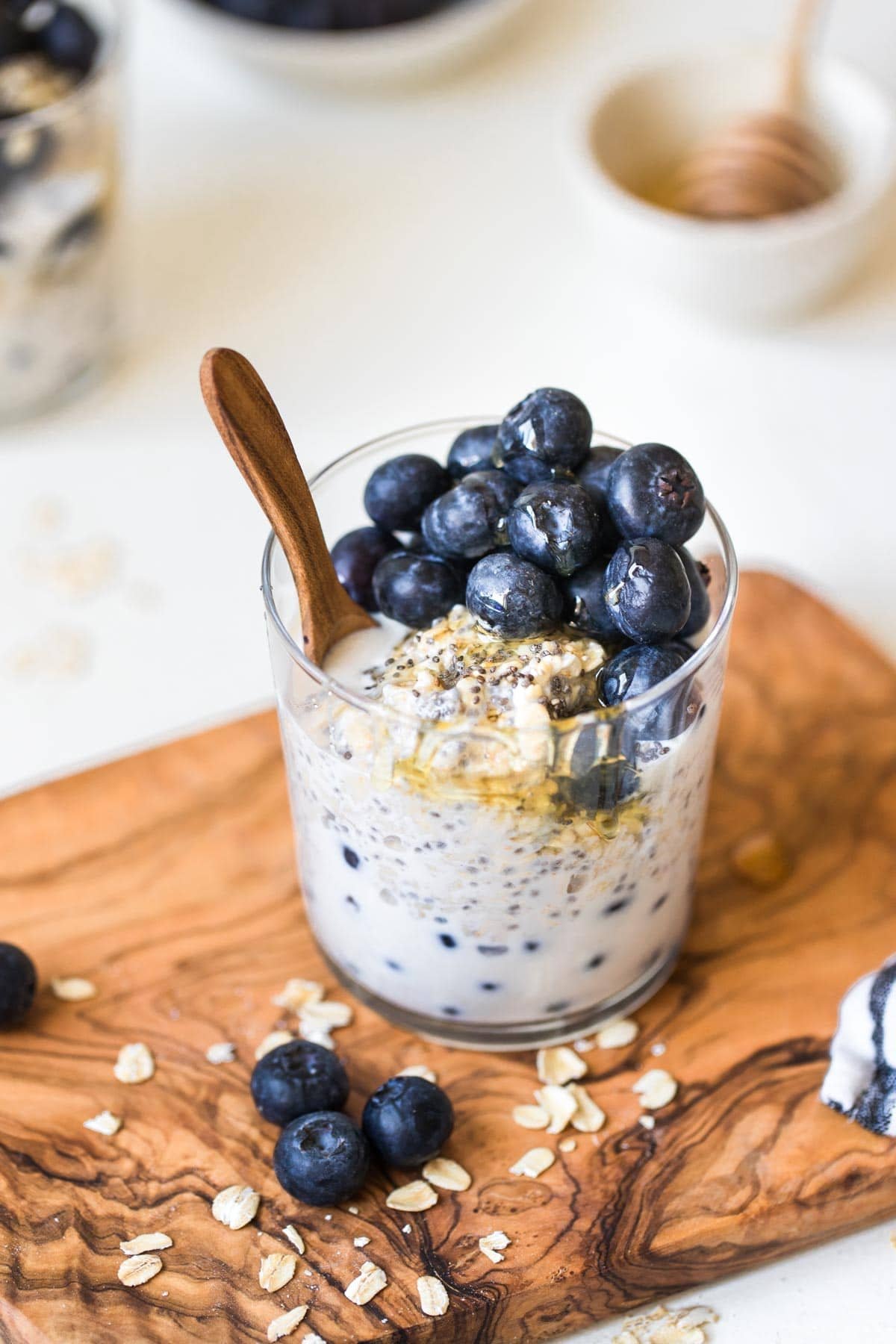
Organic yogurt brand with flavors of oats and berries. A dark shade of blue with creamy colors to display the smooth texture of the yogurt itself. Focusing on the imagery to communicate the actual feel of the yogurt, along with the flavor. I want the cup packaging to be paper-based, and the only part of the packaging that is plastic is the lid.

design details
OAKAO's idea was from the 50-day logo challenge that was initially meant to be a fashion clothing brand, but instead, I thought of the letters as a yogurt brand. I imagined a rounded and playful typeface the minute I saw the name brand and went with my gut. For the colors, I wanted blue to be a significant part of the design and have the top lid the bold background with the outlined logo, and the label to have a variety of visuals. The line underneath the type itself represents a “smear” of yogurt, like the yogurt visual on the packaging.

